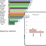


With its worldwide business expanding and evolving for more than a decade, Lenovo’s most dramatic transformations, from becoming a global leader not just in PCs but also in tablets, smartphones and a host of other devices, have been happening in the last five years. The proud unveiling of a new brand identity, then, doesn’t come as a surprise, as Lenovo’s vibrant new company persona is aimed to make a huge difference in conveying the company’s attitude and energy to the world.
“Lenovo is always about making progress, moving forward,” said Michael Ngan, Country General Manager, Lenovo Philippines. “Lenovo is very confident about its long-term success as a global technology leader. The changes that have been taking place in Lenovo have been multi-faceted–from being solely a PC company, to going into new business segments including tablets, smartphones and servers, and expanding the company’s global footprint with the acquisition of Motorola Mobility and System x. It’s time for our brand identity to reflect these amazing evolutions as we continue to build on our successful Protect and Attack strategy. We will protect our PC leadership while attacking our new engines – mobile, enterprise and ecosystem and cloud businesses – for growth,” Ngan added.
More than a redesign, Lenovo’s new brand identity is built around the fundamental belief that life rewards those who never stand still. From the logo to the rally cry along with the campaigns, the new identity offers a more personal, engaging and consumer-centric experience that reflects Lenovo’s personality and incorporates its rich heritage of acquisitions and original innovation DNA.
Lenovo has observed that its overarching master brand position is not just about constantly innovating within the company, but that it is shared by its key customers. Whether they’re millennials who constantly look for new experiences, professionals who continue moving towards a myriad of goals, entrepreneurs and large enterprises that move faster than ever before, they exhibit an energy in them that drives them forward and impels them to never stand still.
The new Lenovo brand is all about people, what they make, what they do every day to make the world —their world — better.
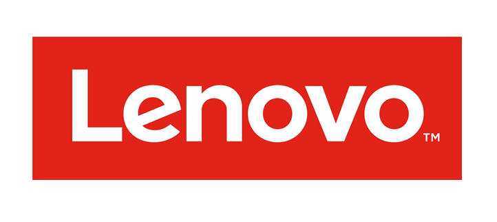
Debuted during Lenovo Tech World in Beijing last May, the new logo is the cornerstone of Lenovo’s new brand identity. It consists of the word Lenovo, a white wordmark within a containing shape, which now uses a typeface and a design that’s more contemporary, making it more readable so there are no pronunciation issues around the world.
The second element is the containing shape which allows it to be used as a tag like a fashion brand. It gives the logo room to breathe, as well as an opportunity for a playful use of the logo such as by filling the box with color and images, the better to bring it alive, and personalize it for specific products, people, places and events.
In addition to the primary logo, there is a collection of animated logos that feature carefully selected images that cycle behind the Lenovo wordmark in the containing shape. This style is not intended for use as a static Lenovo logo, as it works best as an animation.
There is also a significant change in the color palette. Aside from to the previous Lenovo colors – Red, Black, and shades of Gray – there will be Oranges, Blues, Pinks and Greens, given that the company is now well embedded in the consumer space.
Together, all of these elements make the logo fun, energetic, highly relevant, completely dynamic, and evolves based on its environment. It is intended to make people recognize Lenovo wherever it may be, to clearly see what it stands for, and to communicate the message that Lenovo never stands still.