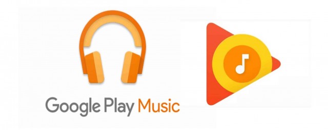
With the support of the recently released podcast, Google Play Music launched its new logo that closely resembles a pizza.
Last April 18, 2016, Google Play Music ditched the two-tone headphone logo and replaced it with a four color triangle-and-circles that look like a breakfast pizza. The reddish color seems to represent a pizza sauce, yellow for eggs, orange for cheddar to top with a white music note that represents a goat cheese.
Google has never settled for a subtle approach, and the new loud logo was made to be noticed just like Apple’s music and Spotify logo, however, according to some opinion, it does not appear to have the credit it used to have and the clarity of the new logo has gone missing.
(Photo Source: Google Play Music/theverge)


