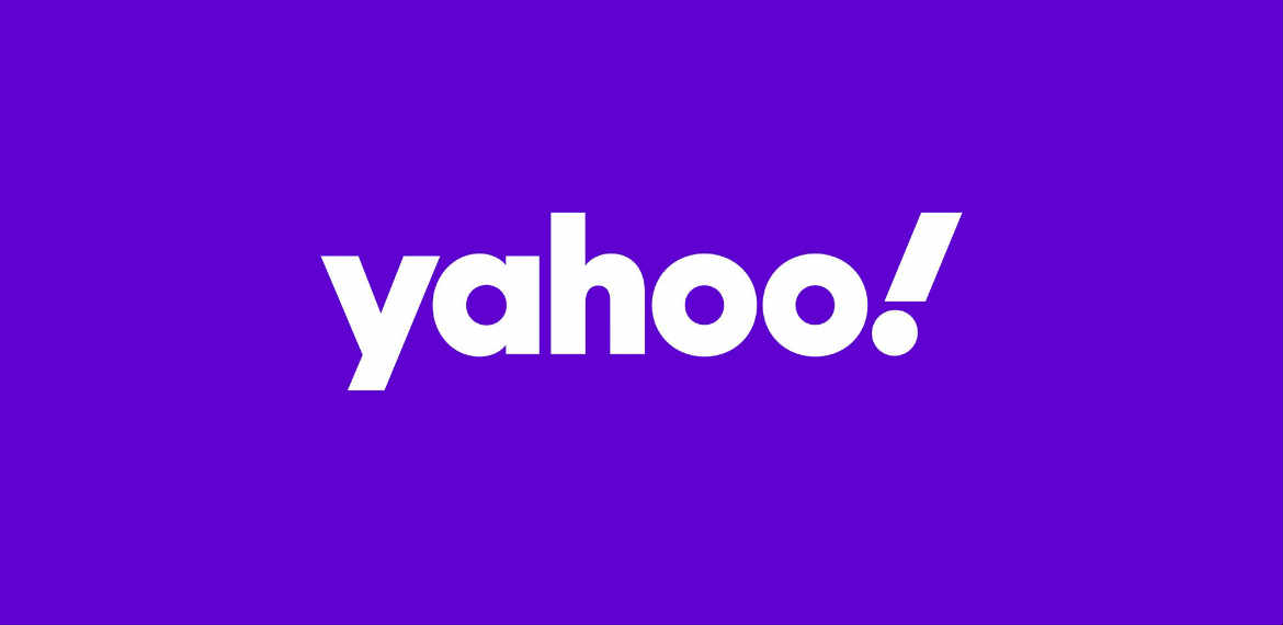
Yahoo made an unexpected comeback as it recently unveiled its newest logo since its last redesign in 2013 under the leadership of then-CEO Marissa Mayer.
According to Pentagram which collaborated with Yahoo for the new design, the new and improved look of the logo came with the launch of new products and enhancements, including a reimagined Yahoo Mail app and other products and services which will be unveiled over the coming year.
“This strategy of simplicity and amplification is expressed in a new logo that is simpler and more flexible than its predecessor, and that looks back to the original, quirky 1996 logo,” Pentagram stated.
Pentagram explained that the new Yahoo logo has an italicized “y” and “!” set at an angle of 22.5 degrees which suggests emphasis and a sense of momentum and excitement. The identity still remains in purple which is Yahoo’s signature color since 2003 but the designers refined the palette for a “more contemporary” look, selecting a primary purple called “grape jelly” and secondary purples referred to as “hulk pants” and “malbec”.
Meanwhile, Yahoo’s identity is further streamlined with a simple “y!” monogram for favicons and social media icons, as well as for sub-brands such as Yahoo Finance, Yahoo Sports, and Yahoo Weather.
(Photo source: pentagram.com)


